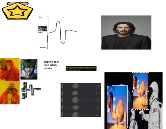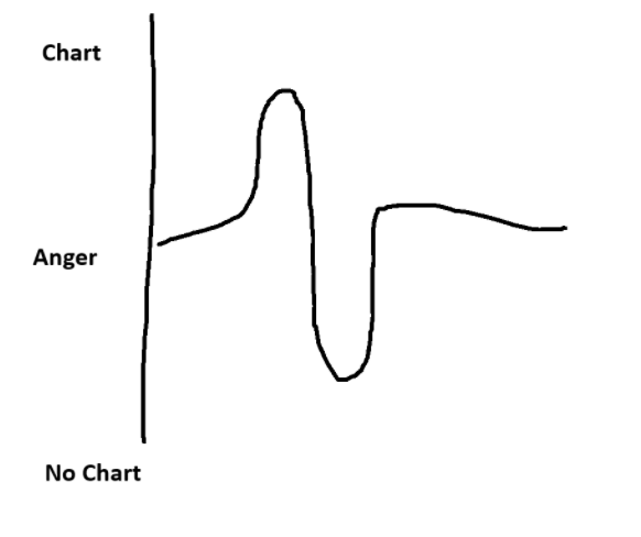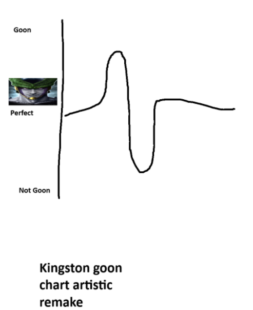


My friend Kingston's attempt at creating a graph turned out to be a complete mess. The axes were improperly labeled, with vague descriptions that made interpreting the data impossible. The lines representing the data were erratic and inconsistent, resembling scribbles more than a coherent representation of information. The overall layout was cluttered and disorganized, lacking any clear structure or readability. It was evident that Kingston's graph lacked the fundamental principles of clarity and precision necessary for effective data visualization.
